


ChatGPT gave you a palette. Here is how to turn it into shades you can actually buy.
The palette is the easy part. The hard part is standing in front of a wall of lipsticks that are all, somehow, "dusty rose". Here is the translation layer between the words ChatGPT gave you and the products on the shelf.
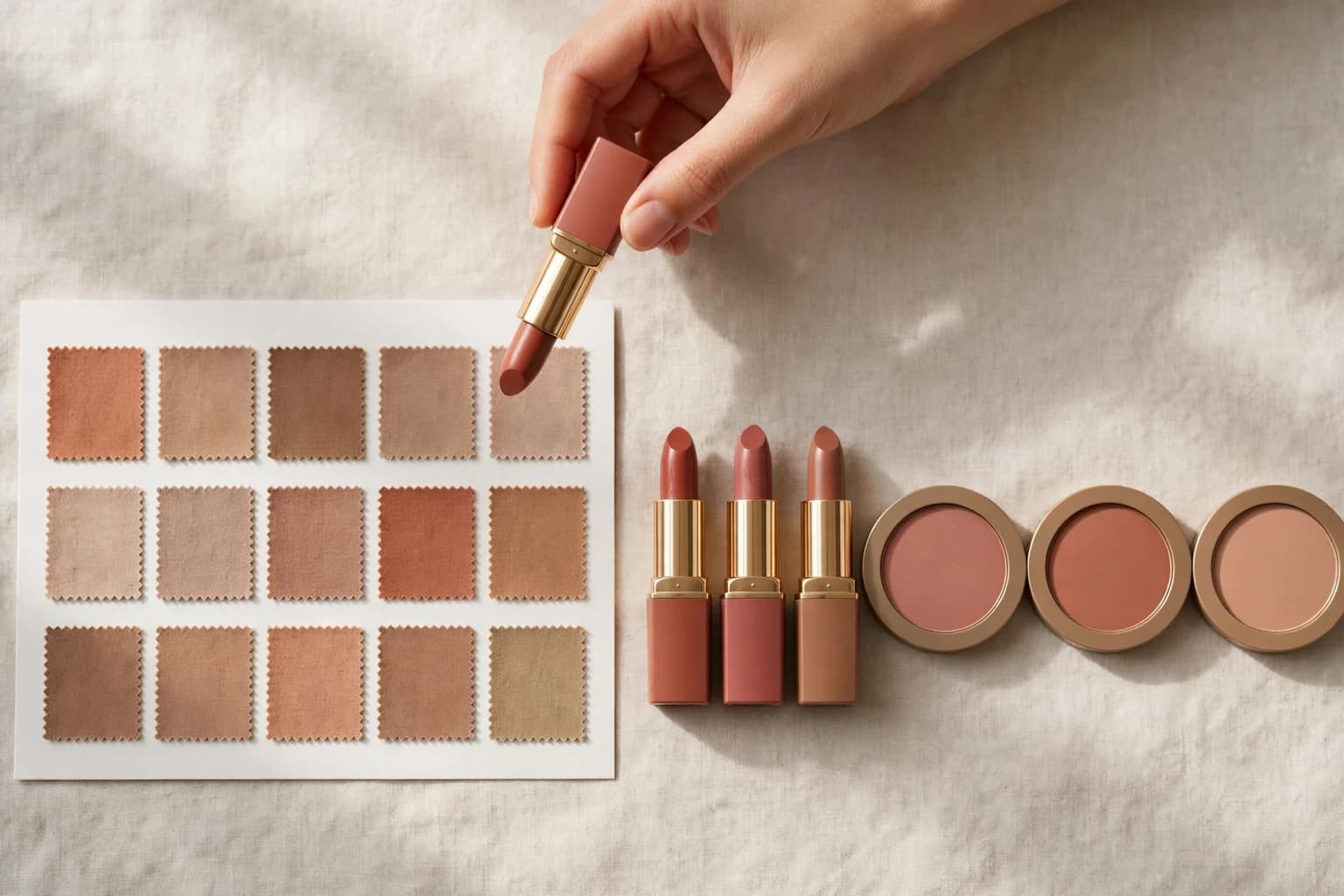
A palette word covers a family of shades, not a product. The buyable answer is the named shade that sits inside the family and survives on your face.
Direct answer
ChatGPT gave you a palette. Which exact shades do you buy? Decode every palette word into three settings, temperature, depth and softness, then shop shade families that match all three, and test the finalists on your own photo before you pay. "Terracotta" is not a product; it is a warm, medium, muted family that contains dozens of named lipsticks, blushes and hair colors, some of which will suit you and some of which will not. The palette narrows the wall of products to a shortlist. Your face makes the final call.
Why is a palette so hard to shop from?
Because palettes are written in color language and shops are stocked in product language, and the two do not line up. Prismatic Style, a colour analysis studio that tested the ChatGPT workflow, names the gap exactly: if ChatGPT recommends that you wear teal, "it can be hard to know which teal is the best teal for you", because every palette holds subtle variations that a single word flattens. The same problem shows up in the viral workflow itself: The Sun's report of the original TikTok has ChatGPT advising "foundations with yellow or golden undertones", which is a direction, not a shade. The user still has to walk into a shop and choose between forty golden foundations.
There is a second trap underneath. A palette word means whatever the writer of that palette meant by it, and palettes are not standardised: one system's Soft Autumn rose is another system's everyday pink. So the word travels badly between the chat window, the blog post you screenshot, and the brand's shade names. The fix is not a better word. It is translating the word into settings you can check against any product, on any shelf, from any brand.
How do you decode a palette word into settings?
Every color word in your palette is carrying three pieces of information, and brands quietly print all three on their products if you know where to look:
Write your season's three settings at the top of your shopping list. From then on, a shade is a candidate only if it matches all three. That single rule is what turns a palette from a poster into a filter.
- Temperature: warm or cool. In foundation, this is the undertone letter and the shade name's temperature words: golden, warm and honey on one side; rosy, cool and pink on the other. In lipstick, it is the difference between a brick red and a blue red. Get this one wrong and nothing else matters; temperature is the setting your skin argues with.
- Depth: how light or dark the color is. Palette words like "soft", "light" and "deep" are depth instructions as much as mood words. A Deep Autumn's burgundy and a Light Spring's coral can share warmth and still be four shelves apart.
- Softness: bright or muted. "Dusty", "smoky" and "muted" mean grey has been mixed in; "clear", "bright" and "electric" mean it has not. This is the setting that separates the two roses everyone confuses: dusty rose (muted, Summers and Soft Autumns) and hot pink (clear, Winters and Bright Springs).
What should each season group actually buy?
Work from your group first; the named shades below are anchors inside each family, not the whole family.
If you are between two groups, shop the overlap first. The shades two neighbouring seasons share are the safest money you will spend, because they survive even if the label moves.
- Springs (warm, light to medium, bright): peach and coral blush, warm pink and coral lips, golden and honey hair tones. Your red is a warm, clear orange red: MAC Lady Danger is the classic anchor our red lipstick guide files under warm seasons. Avoid icy pinks and ash hair shades, which fight your brightness.
- Summers (cool, light to medium, soft): dusty rose, mauve and cool pink blush; rosewood and soft raspberry lips; ash brown and cool blonde hair. Your colors should look slightly greyed, as if seen through soft light. Avoid orange based anything; warmth reads as dirt on cool, muted skin.
- Autumns (warm, medium to deep, soft): terracotta, brick and warm rose blush; brick red, cinnamon and espresso toned lips; copper, chestnut and warm chocolate hair. Your red is an earthy one, deepened rather than brightened. Avoid clear fuchsia and blue based pinks, which sit on top of warm skin instead of settling into it.
- Winters (cool, deep or very light against dark features, bright): clear fuchsia, berry and blue based pink blush; blue reds and true berries on the lips; blue black, espresso and icy blonde hair. Your red is the famous one: MAC Ruby Woo, the blue red our guide recommends for cool, high contrast faces, with NARS Cruella as the matte alternative. Avoid muted, dusty versions of everything; softness washes you out.
What does your palette mean in salon numbers?
Hair color is where the translation gap costs the most, because salons do not buy "warm autumn brown" either. Professional color is sold by number: the digit before the point is the level, meaning depth from 1 (black) to 10 (lightest blonde), and the digits after the point are the tone family. Stylists post formulas in this code because clients demand it: the L'Oréal Professionnel post quoted across TikTok reads "iNOA shade 6.46 + 6.4 + 7 on the roots", which decodes as a level 6 base carrying copper and mahogany tones. Your three settings map straight onto the code. Depth is the level. Temperature and softness live in the tone digits: golden and copper tones for warm palettes, ash and iridescent tones for cool ones, and the muted seasons take their tone softened or mixed rather than pure. So when you book, bring both languages: the shade family in words, for the consultation, and the level you previewed, for the formula. The preview on your photo is what fixes the level; the palette alone never could.
How do you test a shade against the palette before buying?
Two tests, in order. The first costs nothing: put the product photo beside your palette on your phone, in the same light, and check the three settings, not the vibe. Does the shade read warm or cool, light or deep, clear or muted? Product photos lie about exact color, but they rarely lie about all three settings at once, so a shade that fails the settings check can be rejected from your sofa.
The second test happens on your face, and it is the one that decides. A lipstick that matches your palette on a swatch card can still fight your lip color, your teeth, or your contrast. Run the two finalists on your own photo and look at what your skin does: the right shade evens the skin out and sharpens the eyes; the wrong one makes you look tired under perfect makeup. Buy the winner, not the pair.
Two finalists, one photo, two minutes. That is the whole test:
Which products should you buy first, and which can wait?
Buy in the order your face shows them, and treat each purchase as a test of the palette itself, because a shade that behaves exactly as its settings promised is evidence the label is right. Lipstick first: it is the palette's flag, the cheapest full test of temperature and softness, and the product you will rebuy for years once it is right. Blush second, matched to the lip family rather than matched to the lipstick itself; same temperature, one step softer. Foundation third, and buy it by undertone and depth, not by palette poetry: the palette tells you golden or rosy, the shade finder tells you which golden. Hair color last, because it is the most expensive to undo; by the time you book it, you want the palette checked, the shade family proven on your lips, and the finalist colors already previewed on your photo.
Source: Uptone hub: What color season am I? The 12 seasons
Source: The check-the-label companion workflow and its evidence (BuzzFeed's 400,000 plus saves test)
Source: Season settings, signature shades and the red lipstick anchors follow Uptone's own shipped guides
Shop the label only after you have checked it
Everything in this article assumes the palette is right, and the palette came from a label a chat AI produced from one selfie. Our companion guide exists because that label is often one setting off: check the season on your own face first, then shop it. A wardrobe built on an unchecked label is just a more expensive guess.
Take the theory out of it.
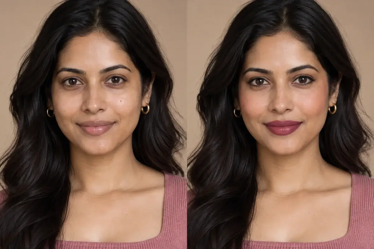
The article's method ends in a visual test: finalist shades from the reader's own palette, on the reader's own face, judged by what the skin does. The makeup try-on is that test, one shade at a time.
Questions people ask
ChatGPT gave me color names but no products. How do I find the actual shade?
Translate each name into temperature, depth and softness, then look inside product families that match all three. Brands sell named shades within those families, so "warm, medium, muted red" lands you on brick and terracotta reds rather than on a wall of forty reds.
Which teal is my teal?
The one that matches your settings. A Summer's teal is muted and medium, an Autumn's is deepened toward petrol, a Winter's is clear and icy, and a Spring's is warm and bright. Same word, four different products; the settings are what you are actually shopping for.
Can I shop my whole palette at one brand?
You can, but you do not need to. Palettes are brand neutral, and most brands cover the main shade families with different strengths. Buy the lipstick where the formula suits you and the blush where the shade is right; the palette is the filter, not the shop.
Should I buy foundation from my palette?
Buy it from your undertone, which the palette confirms but does not measure. Use the season to choose the family, golden or rosy, then match depth against your jaw in daylight. Our foundation guidance starts from undertone for exactly this reason.
What if the shades I buy from the palette look wrong?
Suspect the label before the shopping. One wrong setting in the season, most often temperature, makes a whole palette quietly wrong. Recheck the season visually, then reshop the corrected settings; the decode method stays the same.