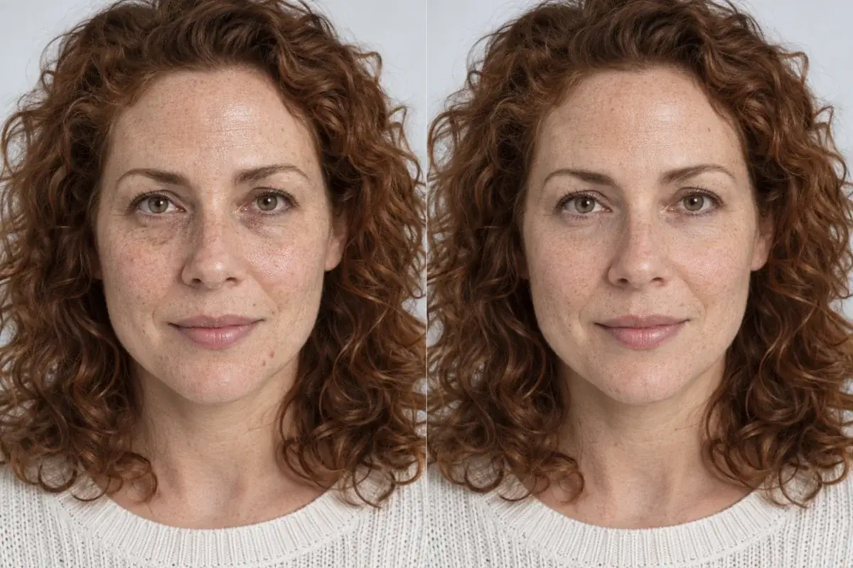
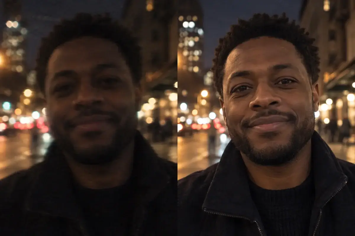
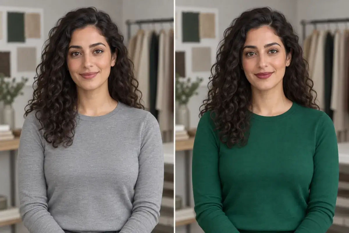
Find your best blush placement and colour on your own face.
Blush goes wrong two ways: wrong place, or a shade that fights your undertone. Preview cream and powder blush, placed where you actually wear it, on your own photo.
Try blush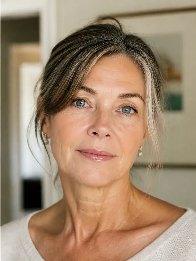
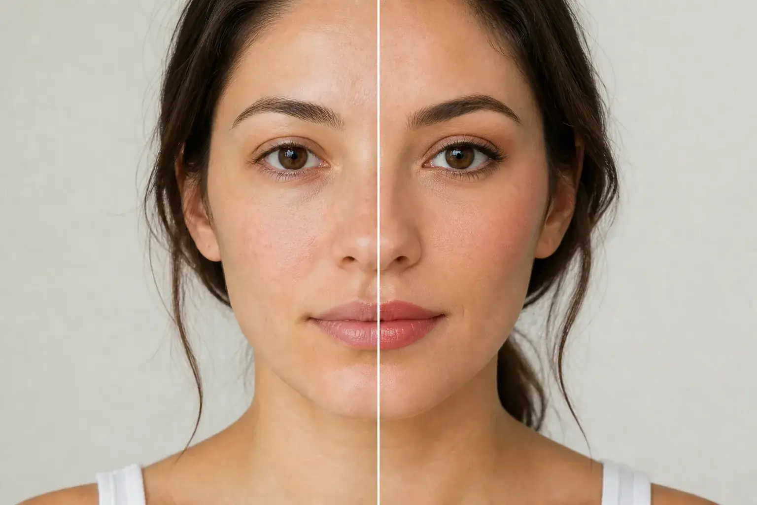 BeforeAfter
Wearable colour and placement
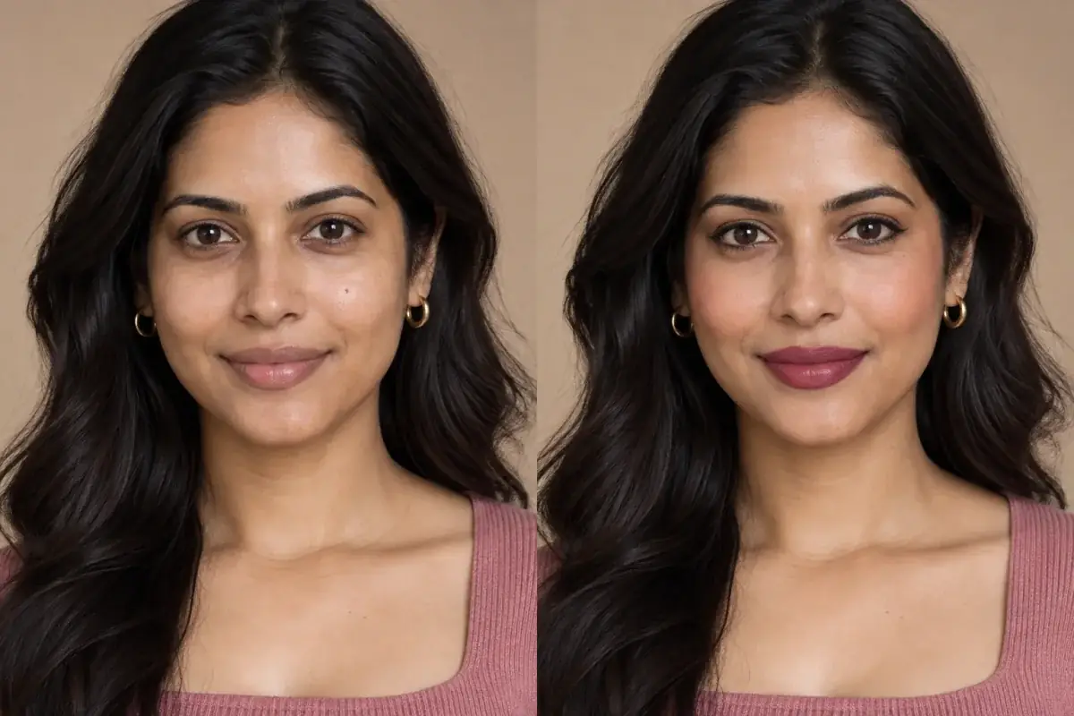
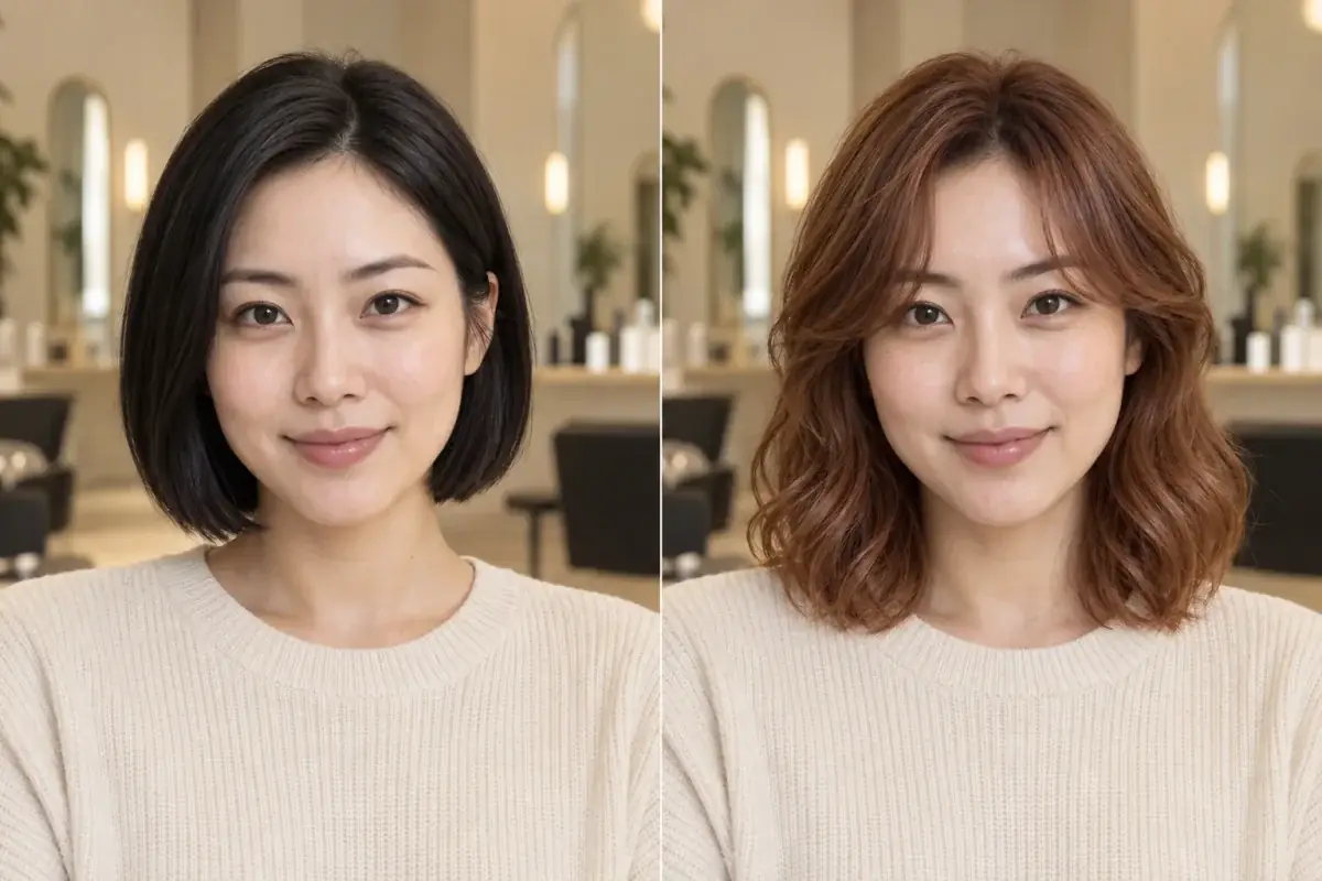
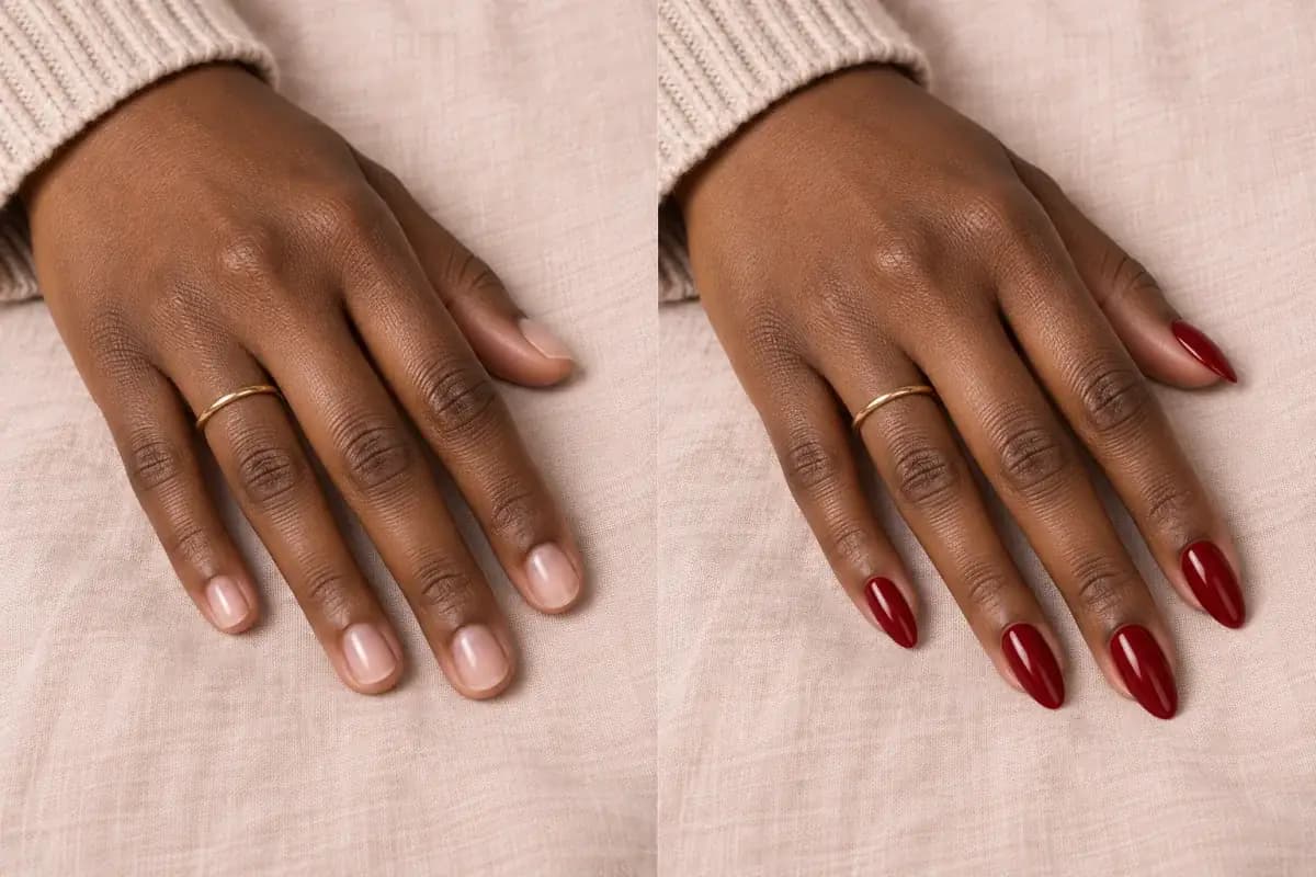
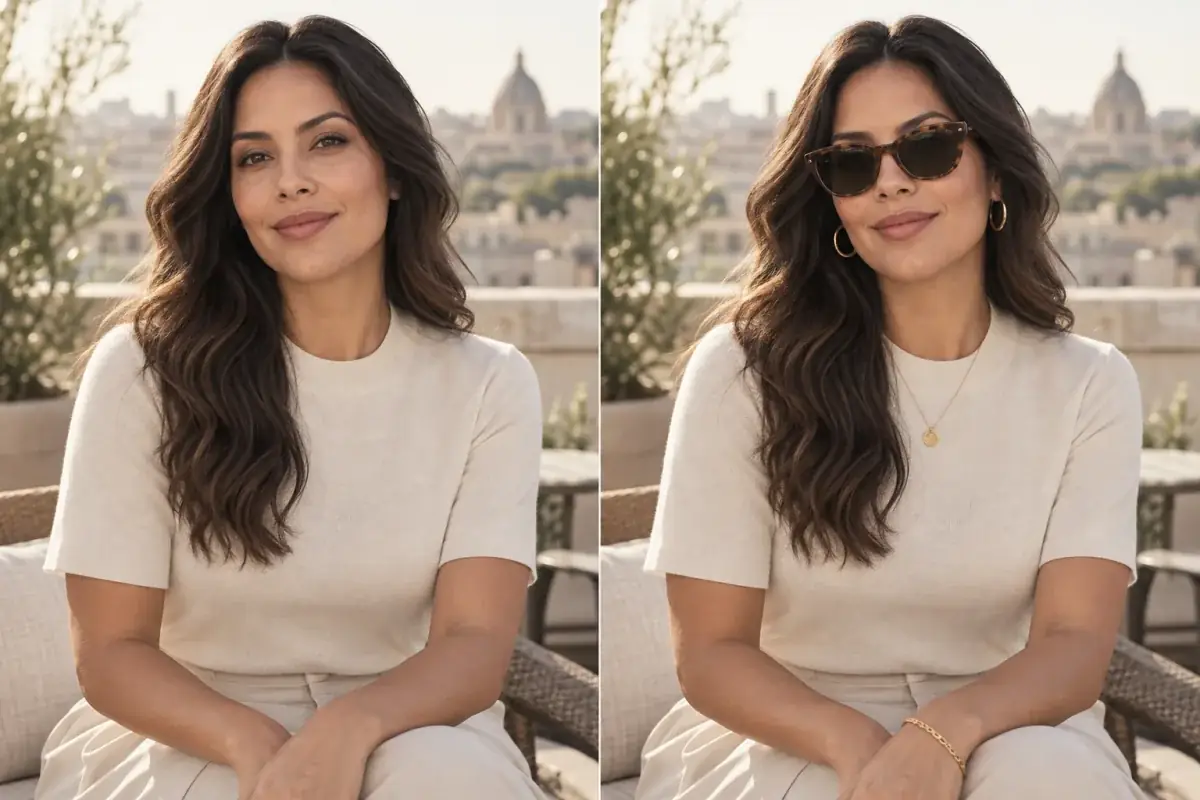
The original stays beside the edit, so you judge the tool on the same person, pose and camera angle.
Try makeup editorSee blush in motion.
The moving cards wipe between a real before and after. The still cards are finished looks, and the full strip scrolls continuously.
How it works
- Loading preview…
The adapted result, with your identity held steady Add your photo
Upload a clear, front facing photo with your cheeks bare or in your usual base. If you normally wear foundation, keep it on: blush sits differently over a base than on bare skin.
- Loading preview…
A reference you can actually take to a professional Choose shade, formula and placement
Name the shade family (peach, rose, berry, terracotta), the formula (cream or powder) and where you wear it: apples, high on the cheekbone, or swept up toward the temple. Change one thing at a time so you can see what changed.
- Loading preview…
A clear before-and-after preview on you Compare at arm's length
Zoom out before you judge. Blush that looks strong in a close up often reads as a healthy flush at normal distance. Keep the version that still shows when the photo is small.
A blush reference that is actually yours
- Your chosen shade placed on your own cheeks, at the height and angle you actually wear.
- Cream and powder versions of the same colour, so you can see how each finish sits.
- A side by side with your original photo, your face shape untouched. Only the blush changes.
- A saved reference of shade and placement for when the product arrives.
Placement changes your face more than shade does
The same blush reads as three different products depending on where it lands. High on the cheekbone it lifts the face. Across the apples it reads younger and rounder. Swept toward the temples it pulls the face longer. Shade matters second, through undertone: peach warms sallow skin, rose suits cool colouring, and berry gives deep skin a flush that pale pink cannot. Uptone lets you move both levers on your own face first.
Where this struggles
Intensity is easy to misread
A screen cannot show how a blush builds. Cream formulas in particular go on sheerer than they look in the pan and deepen as they settle. The preview shows the end colour and position, not how many layers it took to get there, so start lighter than the preview.
It cannot judge your skin texture
Powder blush can sit on dry patches; cream blush can slide on oily skin. Neither shows up in a still preview. Let your skin type make the formula call, and use the preview for shade and placement.
Your photo stays yours.
Uptone edits your own photo rather than replacing you with a generic model. It never rates your appearance, and you can delete your photos whenever you choose.
Questions people ask
- Where should blush sit on a round face?
- Higher and further back than you probably place it now. Colour on the apples emphasises roundness; colour on the upper cheekbone, angled toward the temple, adds length. Preview both positions in the same shade: the difference is obvious in seconds, and it is the comparison a brush and mirror make hardest.
- Cream or powder: which will suit my skin?
- The preview shows how each finish reads: cream looks like skin with colour in it, powder looks like colour sitting on skin; the deciding factor is your skin, not the photo. Dry or mature skin usually wears cream better; oily skin usually holds powder longer. So pick the finish by skin type, and settle the shade here.
- Can I check a shade against my undertone before buying?
- Yes, preview the shade on your own face rather than trusting the pan or a shade chart. Peach on cool, pink toned skin often turns muddy, and cool rose on warm, golden skin can look grey. The clash happens against your specific skin, so test it there.
Retouching is one half of what Uptone does. The other is trying a full makeup look on the same photo.
Try a full AI makeup look