

Eyemaxxing for Blue Eyes: Try the Shades That Make Them Pop
Blue eyes already draw attention, so the right eyeshadow does not need to shout. It needs to contrast. This guide shows which warm shades make blue eyes pop, which soft tones work for quieter days, and how to test every shade on your own photo before you wear it out.
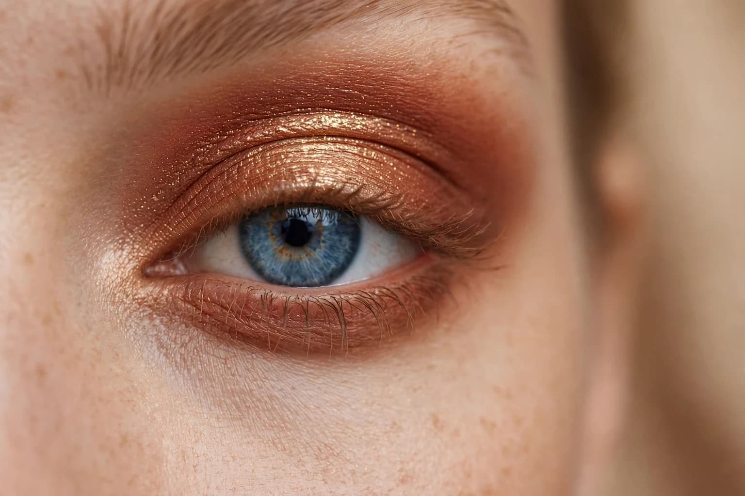
The whole idea in one frame: warm copper and bronze against blue, so the blue reads deeper and brighter.
Direct answer
Blue eyes pop most against warm coppers, bronzes and terracottas, because blue sits opposite orange on the colour wheel, and opposite colours make each other look stronger side by side.
That is the whole method behind eyemaxxing for blue eyes. Warm shades do the contrasting work, soft mauves are the gentler second option for quieter days, and icy blue shadow is the shade to avoid, since it matches your eye colour instead of contrasting with it. The fastest way to find your shade is to try the warm families on your own photo first, because the same copper reads differently on fair, medium and deep skin, and the winner is usually obvious the moment you see it on yourself.
Key takeaways
- Warm coppers, bronzes and terracottas make blue eyes pop, because blue sits opposite orange on the colour wheel.
- Soft mauves and dusty rose are the gentler second option for workdays and minimal looks.
- Avoid icy blue and bright blue shadow, which competes with your eye colour instead of contrasting with it.
- Keep the warmest shade in the crease and the lightest shimmer on the lid, so the eye stays the brightest point.
- Try every shade on your own photo first, since the same copper reads differently on fair, medium and deep skin.
Why do warm shades make blue eyes pop?
The colour wheel is the whole trick behind eyemaxxing. Blue sits opposite orange on the wheel, and colours that sit opposite each other are called complementary, which means each one makes the other look stronger when they sit side by side. Copper, bronze and terracotta all live on the orange side of the wheel, so when they sit next to blue eyes, the blue reads deeper and brighter without any extra effort. That is why a warm eye look can make blue eyes stand out in a way a cool look rarely does.
This is not about painting a bold orange lid. It is about borrowing warmth in the right places: a terracotta swept through the crease, a copper shimmer on the lid, a warm bronze along the lash line. Each warm note pulls the blue forward, while the rest of the face stays calm. The same rule explains why blue eyes can look washed out next to icy blue shadow, since matching the eye colour removes the contrast that makes it pop. Contrast is the point, and warm shades are where blue eyes find it.
Which copper and bronze shades suit blue eyes best?
Start with copper, because it is the closest warm match to the opposite of blue and the most reliable pop. A soft copper works for daytime, a deep copper for evening, and both flatter fair, medium and deep skin, though the depth should shift with your skin: fair skin glows in lighter coppers, medium skin carries classic copper, and deep skin carries the richest, deepest copper without it looking harsh. Bronze is the second family, slightly browner and softer than copper, and the best choice when copper feels too bright for the occasion.
Terracotta is the third family, more muted and earthy, and the best crease shade of the three, since it defines the eye without drawing attention to itself. Warm gold and champagne belong in the inner corner and under the brow, where a small light point opens the eye and makes the blue read clearer. Rust sits between copper and terracotta and suits evening looks, especially with a warm bronze liner. The rule for choosing between them is simple: copper for the strongest pop, bronze for everyday warmth, terracotta for soft definition, and gold only as a highlight, never as the main lid colour.
Finish matters as much as family. A matte copper defines the eye quietly and suits daytime and hooded lids, while a shimmer copper catches light and suits evening, though too much glitter can sit in fine lines, so keep glitter to the center of the lid. If you wear glasses, lean matte in the crease and save shimmer for the lid, since frames already add shine. And if one copper looks too orange on your skin, step sideways to bronze rather than abandoning warmth altogether, since bronze keeps the contrast while softening the orange.
What about soft mauves and cool tones for blue eyes?
Warm shades win for impact, but they are not the only option, and some days call for something quieter. Soft mauve is the best cool leaning alternative for blue eyes, because mauve carries a hint of warmth under its cool surface, so it flatters blue without competing with it. Dusty rose works the same way, giving a soft, polished eye for workdays and minimal looks, while soft taupe defines the crease without adding any colour statement at all.
The trick with cool tones is to keep them muted and warm them slightly at the edges. A mauve lid with a warm taupe in the crease reads softer than a flat cool grey, and a dusty rose with a warm bronze liner keeps the blue visible instead of letting the look go cold. Lavender grey can work as a light wash, but only when it stays pale and sheer, since a strong cool grey drags blue eyes down instead of lifting them. If you love cool tones, wear them as the supporting shade and let one warm note, even just a bronze liner, do the contrasting work.
Which shades should blue eyes avoid?
The main shades to avoid are the ones that match or fight your eye colour. Icy blue and bright blue shadow are the worst offenders, because blue on blue removes the contrast that makes blue eyes stand out, and the eye ends up looking flat instead of bright. The same problem applies to strong silver and frosty white lids, which wash blue eyes out by surrounding them with cold light instead of warmth. Heavy black liner all the way around the eye is another common mistake, since it closes the eye down and hides the blue behind a dark frame.
That does not mean black is banned. A thin black line on the upper lashes, or black mascara alone, still works, because the lid colour above it carries the contrast. What to avoid is black on the waterline plus black shadow underneath, which shrinks the eye and dulls the blue. Very cool greens can also fight blue eyes, since green sits close to blue on the wheel and competes rather than contrasts. When a shade makes your eyes look smaller, greyer, or harder to notice, it is almost always a shade that sits too close to blue itself.
How do you build a blue eye look step by step?
Start with a neutral base across the lid so the colours that follow read true, then sweep terracotta through the crease with a fluffy brush, blending upward until the edge disappears. Next, press a copper shimmer onto the center of the lid with a finger or a flat brush, keeping the brightest point over the iris, since that is where the contrast does its work. Add a warm bronze along the upper lash line, either as shadow or liner, and soften it so no hard line cuts the eye in half.
For the lower lash line, use the same terracotta, lightly, on the outer half only, which frames the eye without closing it. Finish with a warm gold or champagne point in the inner corner and a soft highlight under the brow. For mascara, brown black suits daytime and keeps the look soft, while true black suits evening and adds definition without dulling the blue, as long as the lid still carries a warm shade. Pair the eye with a warm blush and a soft nude or warm rose lip, so the whole face leans warm and the blue stays the coolest, brightest point in it.
How do you try eyemaxxing shades on your own photo?
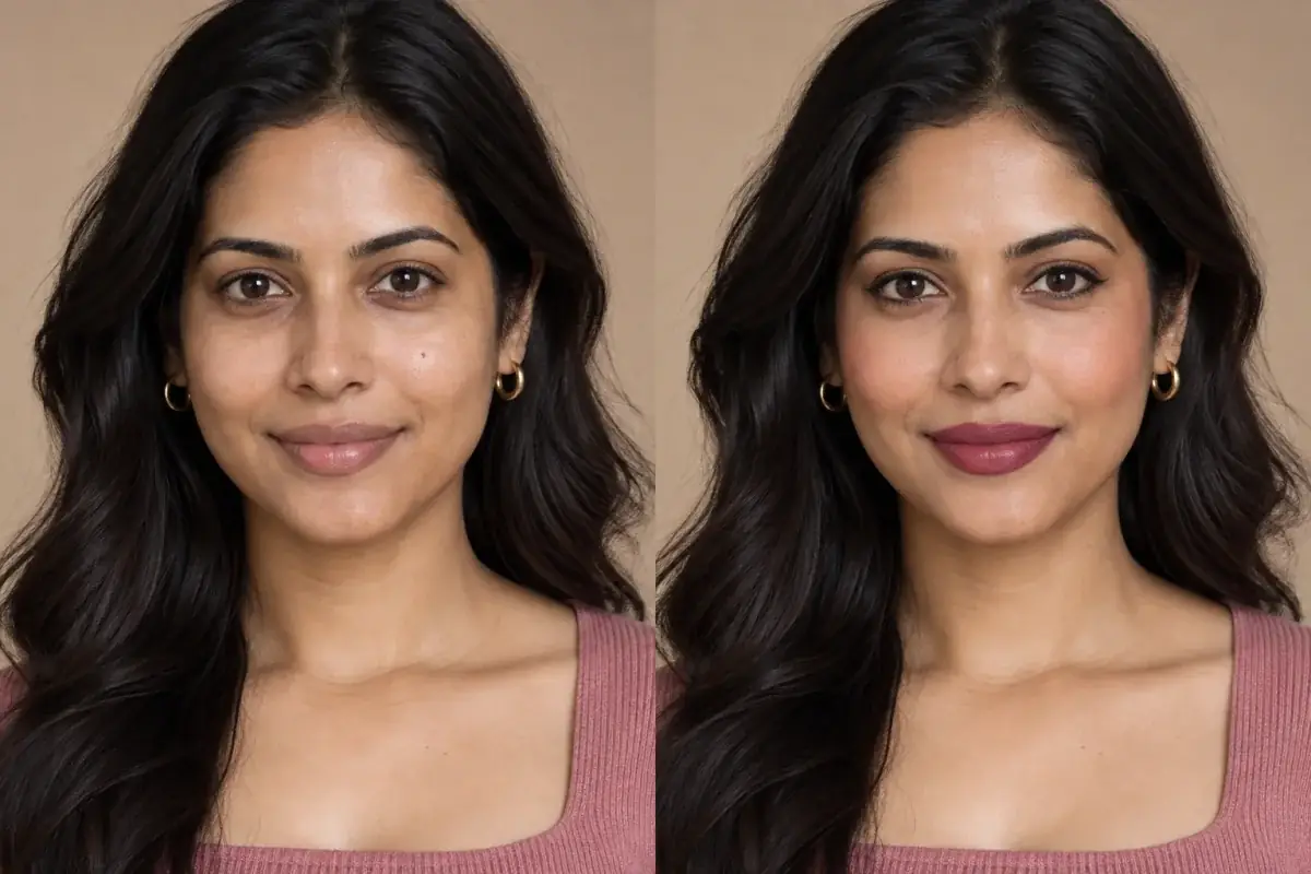
The fastest way to find your copper, bronze, or mauve is to try them on your own photo before you buy or wear them, because the same copper reads differently on fair, medium, and deep skin, and a shade that pops on one person can disappear on another. Upload one clear photo in daylight, open /makeup-try-on, and run through the warm families in order: copper first, then bronze, then terracotta, and judge each one at arm's length, not just close up. If you are unsure which tool fits, the picker at /tools lists them all, and your first preview needs no account.
The hub guide for every eye colour is /blog/eyemaxxing-makeup-by-eye-colour, and the sibling guides for other eyes are /blog/eyemaxxing-for-green-eyes and /blog/eyemaxxing-for-brown-eyes, which follow the same colour wheel rule for their own opposites. Green eyes sit opposite reds and plums, while brown eyes, which carry the most warmth already, suit almost every family but pop hardest against cool contrast. If you are choosing between two shades, save both try on photos and compare them side by side in daylight, since the winner is usually obvious the moment the two sit next to each other.
A try on shows the shade on your photo, not a promise
A photo try on shows the shade on your own eyes, which is far more information than a swatch or a model's photo gives you. It is not a guarantee: screens and lighting shift colour, and a shade can read differently in daylight than under shop lights. Check the winning shade in daylight before you buy it, and compare the saved photo against the shade you hold in the store.
Take the theory out of it.
Blue eyes pop against warm shades, but the same copper reads differently on every skin tone, so the guide points at the makeup try on. Upload one photo, try copper, bronze, terracotta, and mauve, and keep the shade that makes your blue stand out. The first preview needs no account.
Questions people ask
What is eyemaxxing for blue eyes?
Eyemaxxing means choosing eyeshadow from the colour wheel rule instead of guessing, so the shade makes your eye colour stand out. For blue eyes that means warm shades, since blue sits opposite orange on the wheel and opposite colours strengthen each other. The result is a look built around contrast, not around trends, and it works with shades you may already own.
Which eyeshadow colour makes blue eyes stand out most?
Copper makes blue eyes stand out most, because it is the warm family closest to the direct opposite of blue. Bronze is the softer second choice for everyday wear, and terracotta is the best crease shade for definition without brightness. If you buy one shade for blue eyes, make it a copper you can wear sheer by day and layered deeper at night.
Can blue eyes wear cool tones like mauve?
Yes, as long as the cool tone stays muted and carries a hint of warmth. Soft mauve and dusty rose flatter blue eyes because they sit gently against the blue instead of competing with it, which makes them good choices for workdays and minimal looks. Keep one warm note in the look, even just a bronze liner, so the blue still has something to contrast against.
Should blue eyes avoid blue eyeshadow?
In most cases yes, because blue shadow on blue eyes removes the contrast that makes the eye colour pop, and the eye ends up looking flat. The same applies to icy blue and frosty silver lids, which wash blue eyes out with cold light. If you love blue tones, wear them away from the eye, in clothing or accessories, and keep the lid warm.
Do I need an account to try the shades on my photo?
No, your first preview needs no account. Upload one clear photo in daylight, open /makeup-try-on, and try the copper, bronze, and mauve families on yourself before you buy anything. You only sign up when you want to save or download a look, which is worth doing for the winning shade, since the saved photo is the most useful thing to take into a store.