
Picking a lipstick shade, and why most shade charts overpromise
Lipstick is far more forgiving than shade charts suggest. Two categories genuinely care about your undertone, and the rest is preference dressed up as rules.
Where undertone genuinely matters
Most lipstick advice implies every shade is a precision decision. In practice, undertone is decisive at the extremes and close to irrelevant in the middle.
The two places it genuinely matters are true reds and bright corals. A blue-based red on warm skin can read purple; an orange-based red on cool skin can read brassy. Both are visible from across a room, which is why reds have a reputation for being difficult.
The middle of the range (nudes, roses, berries, most pinks) is far more tolerant. This is why someone can wear a shade that a chart says is wrong for them and look completely fine. The chart was describing a tendency and reporting it as a rule.
Finding a nude that is not the wrong nude
Nude is the shade people get wrong most often, and it is because nude is not a colour. It is a relationship: a shade slightly different from your own lip.
A nude lighter than your lip reads as concealer and flattens the face. A nude that matches exactly erases the lip. The version that works for most people is roughly one step deeper than their natural lip colour, with the undertone matched.
This is why a nude that looks perfect on someone else can look strange on you even at the same skin depth: you have different natural lip colours, and nude is measured from the lip rather than from the face.
- Warm skin: nudes with peach, caramel or golden in them.
- Cool skin: nudes with rose, mauve or a hint of pink.
- Olive skin: brown-based or terracotta nudes; pink nudes often go ashy.
- Deeper skin: the same rule applies and the shade names mislead badly: a shade sold as nude is usually formulated against fair skin, so look for the relationship rather than the word.
Finish changes the colour more than you expect
The same pigment behaves like a different shade depending on finish, and this accounts for a lot of the results people find confusing.
Matte reads deeper and more saturated. A red that looked wearable in the tube reads considerably stronger as a matte. Matte also settles into lip texture, which is a comfort question as much as a colour one.
Satin and cream sit in the middle and are the most forgiving, because a little shine breaks up the colour and softens whatever the undertone is doing.
Gloss and sheer read one to two shades lighter than they appear. This is genuinely useful: a shade that feels too bold as a matte is often exactly right as a sheer, and that is a cheaper solution than buying a different colour.
Testing without buying
Two things make in-store testing more reliable than it usually is.
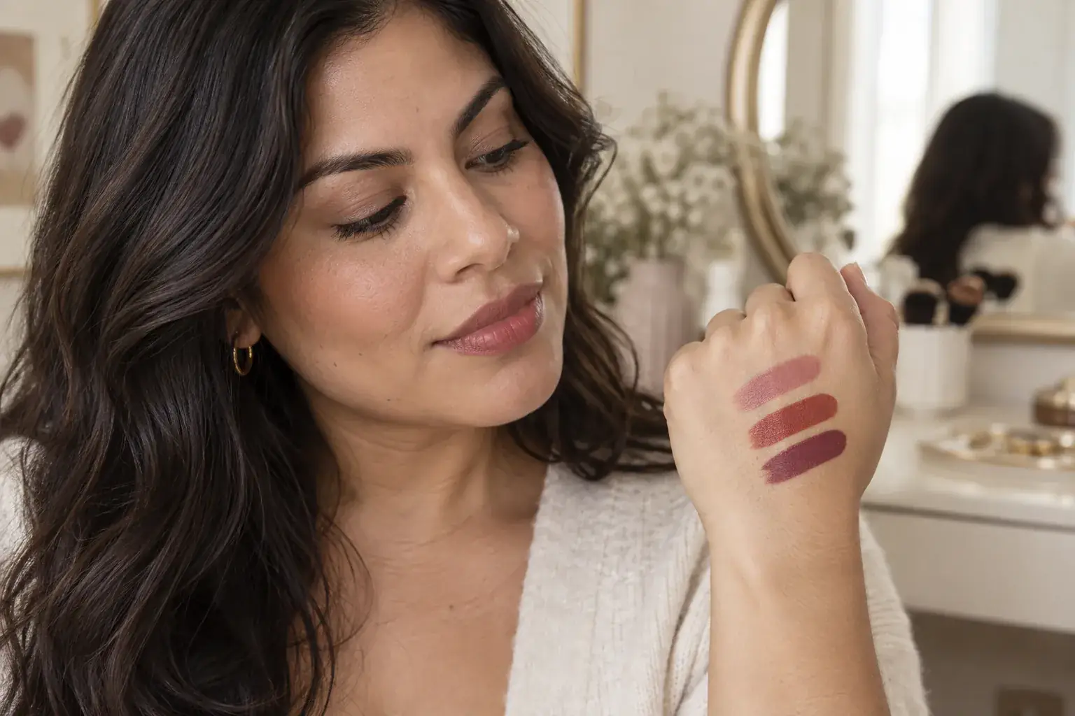
Test on your lip, not your hand. The back of the hand is a completely different colour from the lip and its undertone often differs from the face. It is a convenient surface and a poor prediction. If a tester cannot go on the lip, the inside of the fingertip is closer than the back of the hand.
Then walk to a window. Shop lighting is designed to sell the product and is usually warmer and brighter than anywhere you will actually wear it. Any shade decision made under retail lighting is a decision about how the shade looks in that shop.
Where a screen falls short
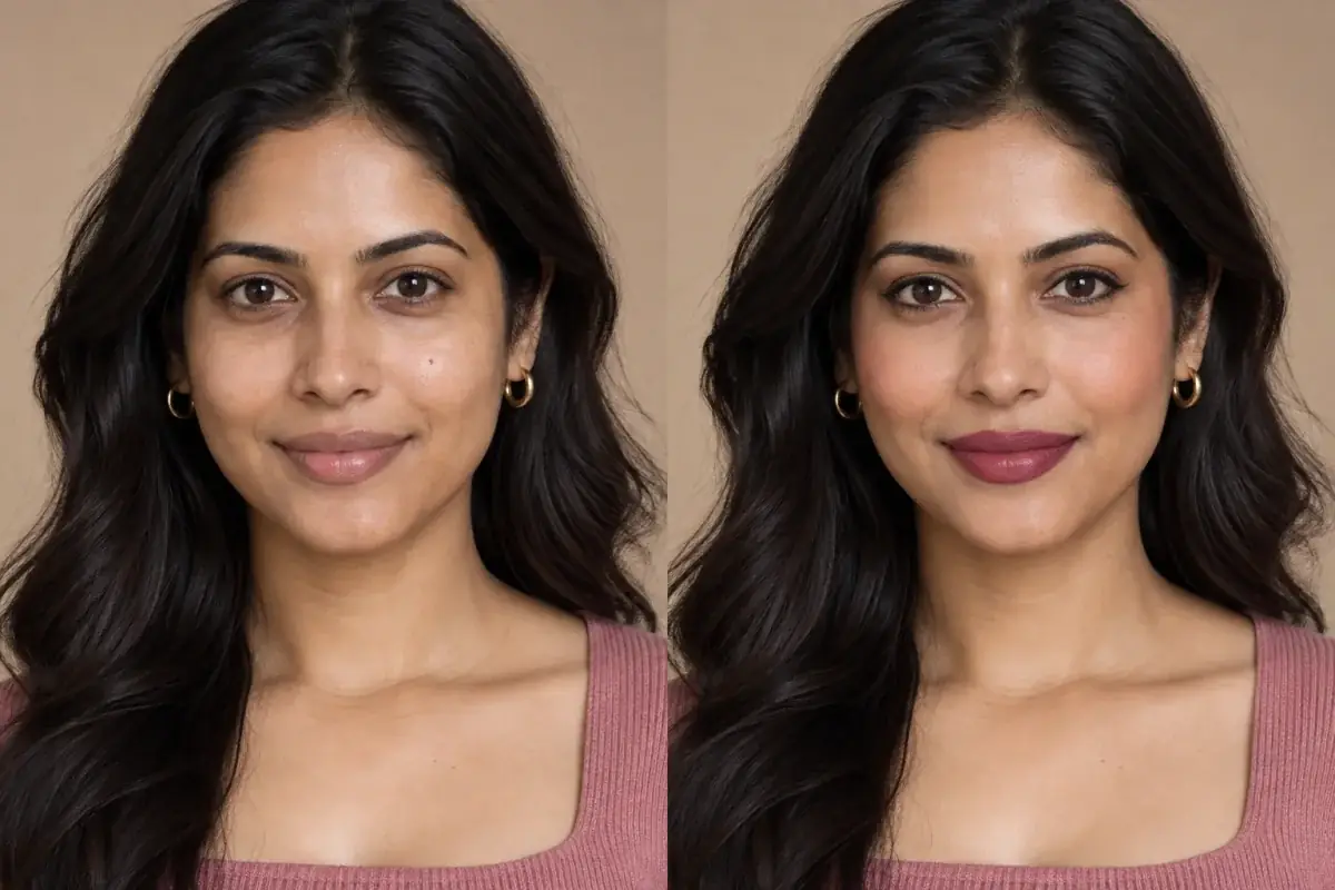
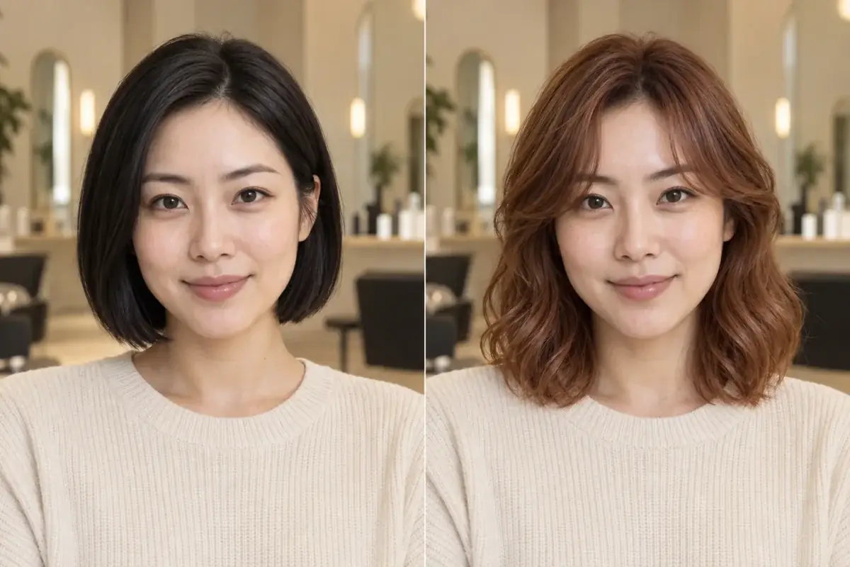
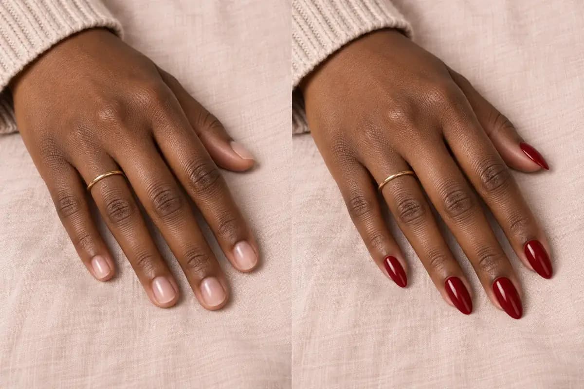
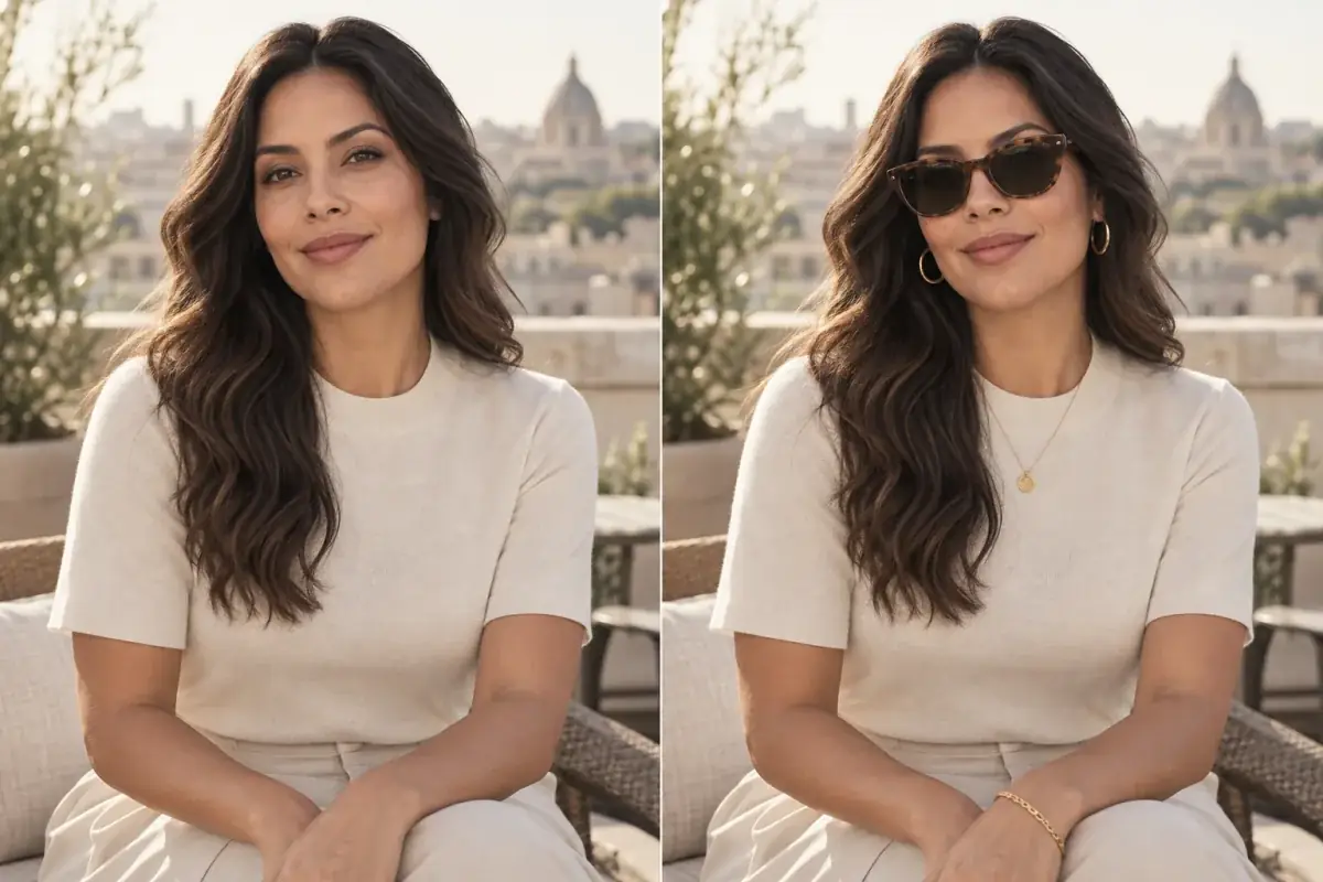
A preview can show you placement, depth and roughly how a shade sits against your skin, which is most of the decision. What it cannot show is finish and texture: how a matte settles into lip lines, how a satin catches light when you move, how a gloss actually feels. Those are physical properties and no screen has them. Treat a preview as a shortlist rather than a purchase decision.
Take the theory out of it.
Twelve lip shades on your own face takes less time than one trip to a counter, and it answers the only question a chart cannot: what this specific shade does against your specific skin.
Questions people ask
What lipstick suits cool undertones?
Blue-based reds, berry, plum, and rose or mauve nudes. Where cool skin usually struggles is with orange-based corals, which can read brassy. That is the shade family worth testing before buying.
How do I find a nude that works?
Start from your natural lip colour rather than your skin tone, and go about one step deeper with the undertone matched. Nude is a relationship to your lip, not a fixed colour, which is why one person's perfect nude disappears on someone else.
Can I wear red if I have very fair skin?
Yes, the variable is which red, not whether. Blue-based reds sit comfortably on cool fair skin and orange-based reds on warm fair skin. High contrast against fair skin makes any red look bolder, which is an effect rather than a problem.
Why does a lipstick look different at home than in the shop?
Shop lighting. It is warmer and brighter than domestic or daylight, and it is designed to make products look appealing. Any shade you are seriously considering is worth carrying to a window before you decide.
Does lipstick need to match my blush?
They need to share an undertone rather than a colour. A warm coral blush with a cool berry lip is the combination that most often looks disjointed; the same blush with a warm rose lip does not.